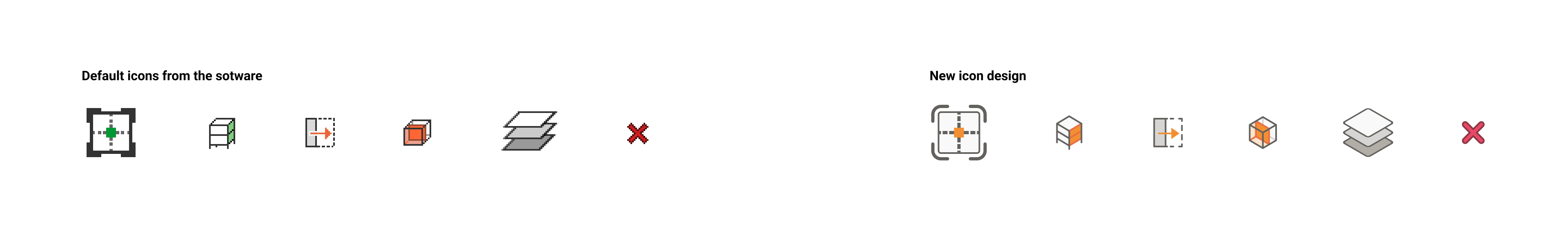
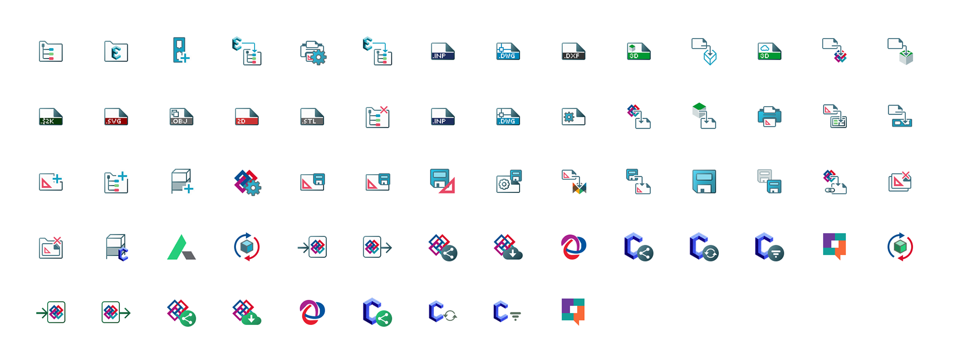
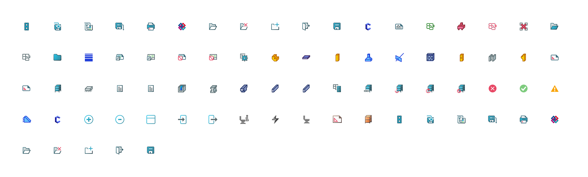
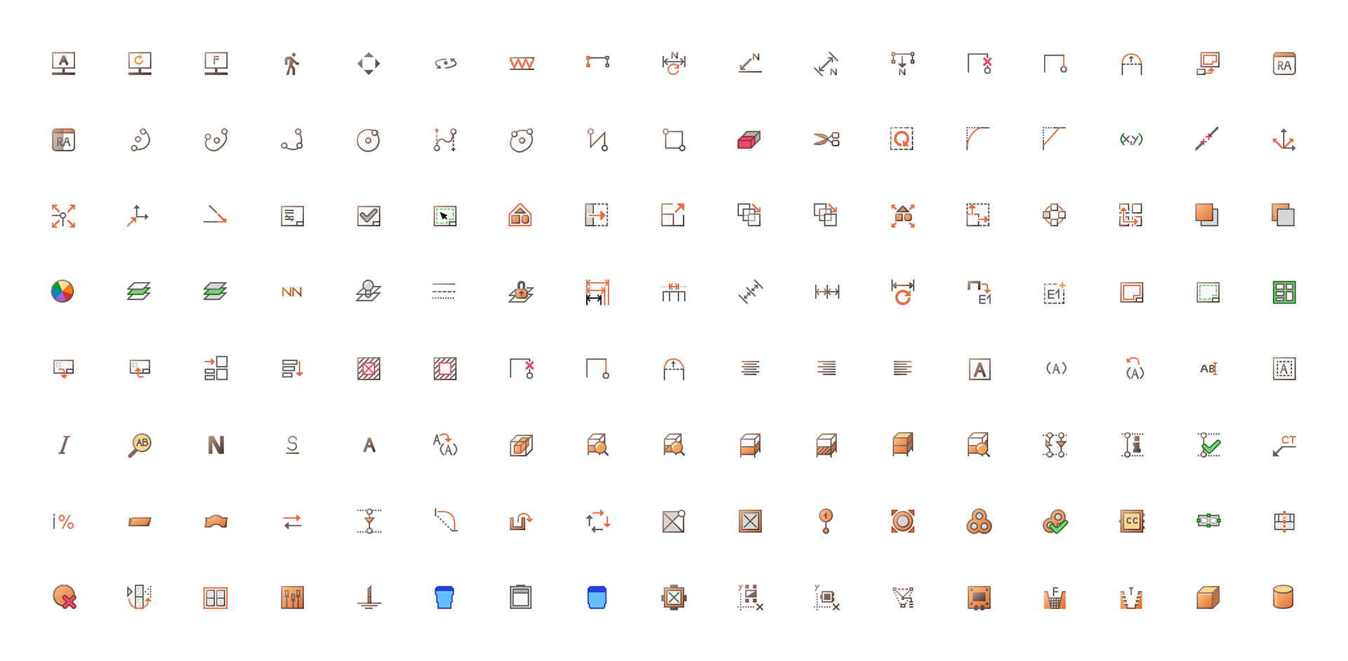
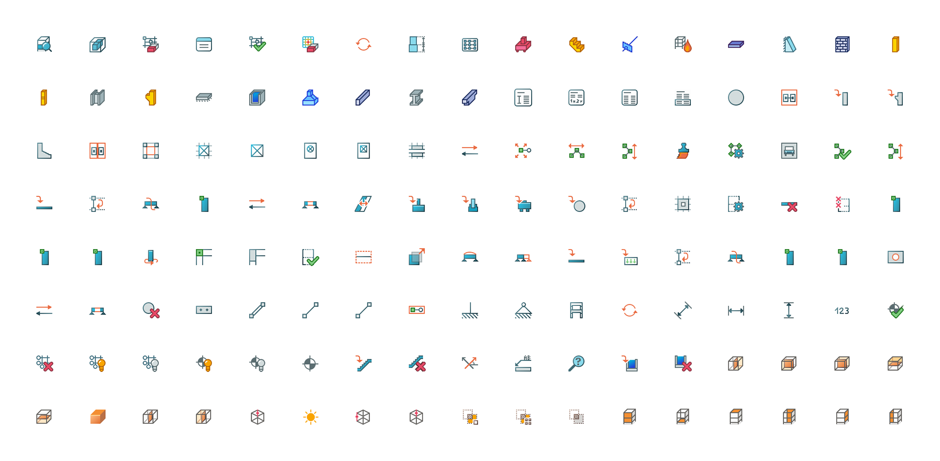
Icon Style Development
Initially, I curated a small sample of icons to define a new design style. This involved modernizing the icons, adjusting their perspective, and standardizing their appearance to meet the client's requirements.
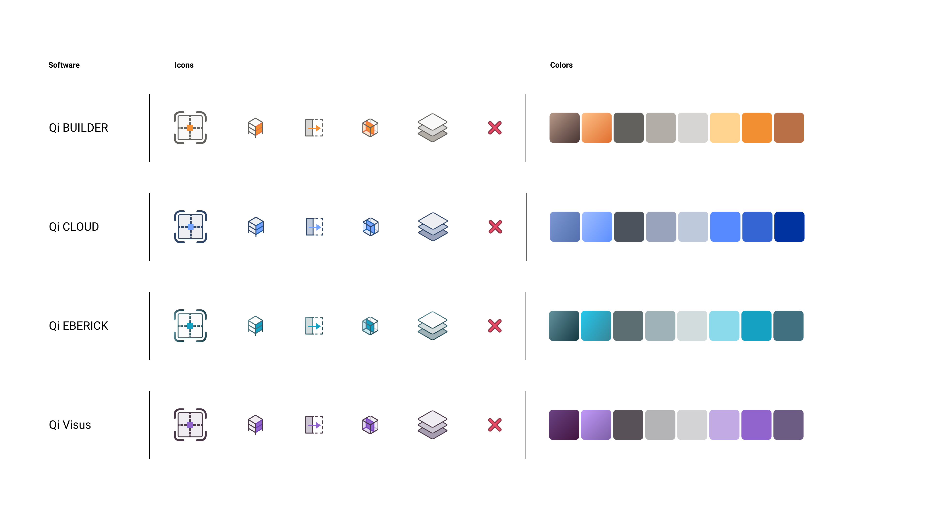
Color Study and Integration
Next, I delved into studying how each software's brand color could be integrated into the icons. I meticulously crafted corresponding colors for various elements of the icons (fill, outline, background, etc.), which were then transformed into color variables within Figma. This allowed for seamless color customization for each icon, tailored to the specific software.
Icon Redesign
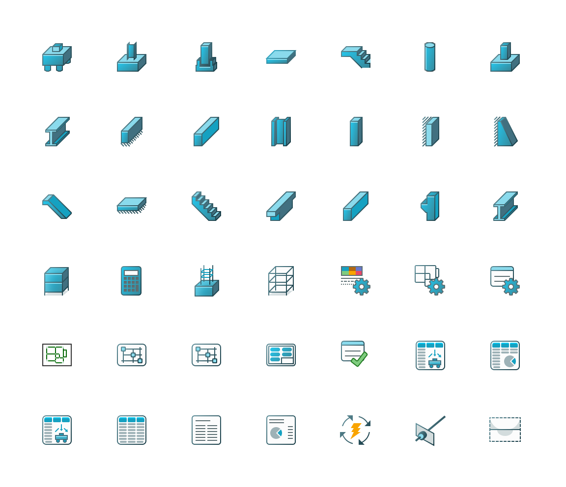
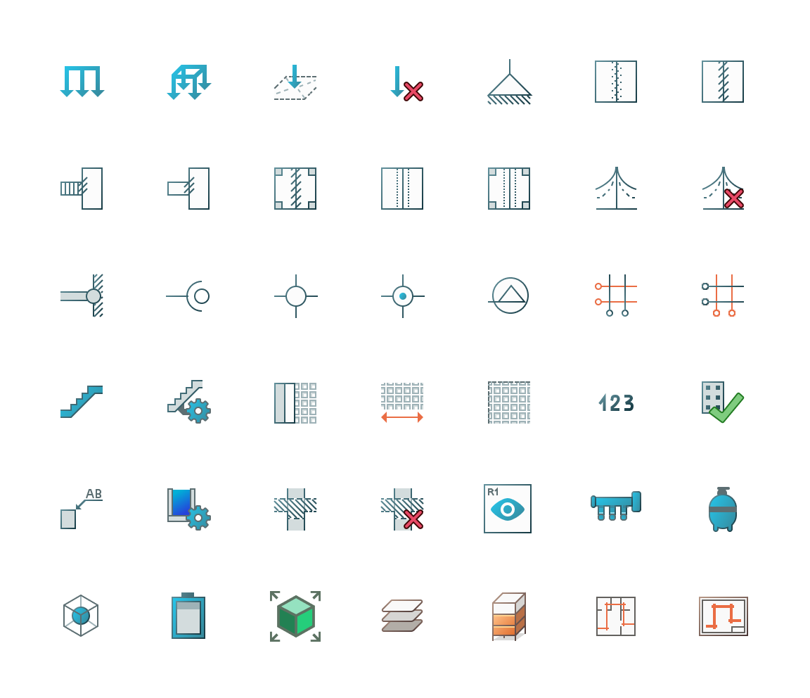
With the design style and color integration established, I proceeded to redesign all 2,000 icons for the software suite. Each icon was meticulously redesigned, with the default icons serving as references. The redesigned icons were then exported and seamlessly implemented into the software by the AltoQi team.
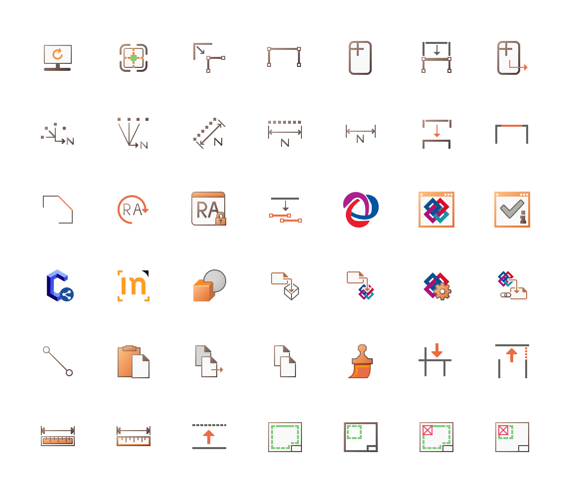
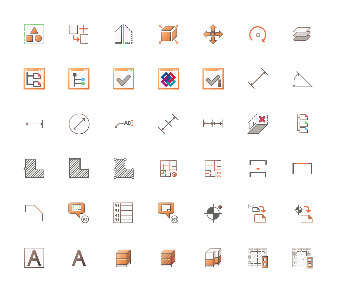
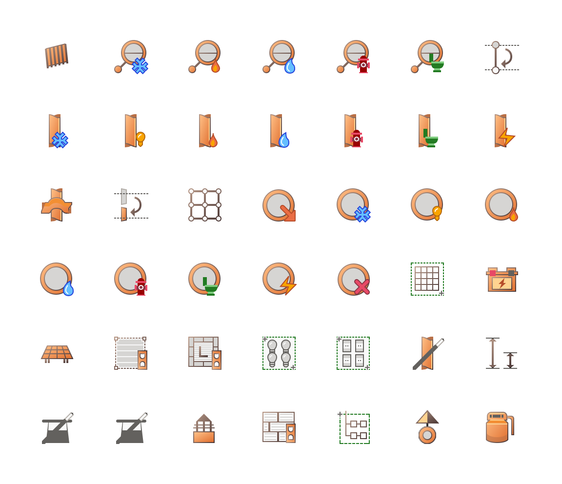
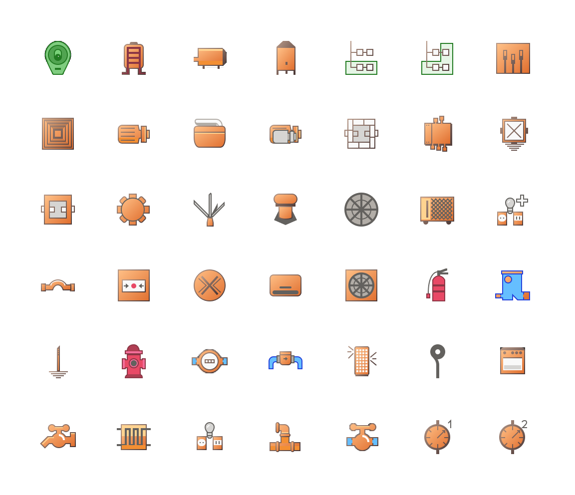
Below, I present a generous sample of the icon set.
Creative Director: Cristiano Fernandes
Design / Art Direciton: Gabriel Raatz
Agency: By Design Studio
Client: Alto QI